Bufdir.no
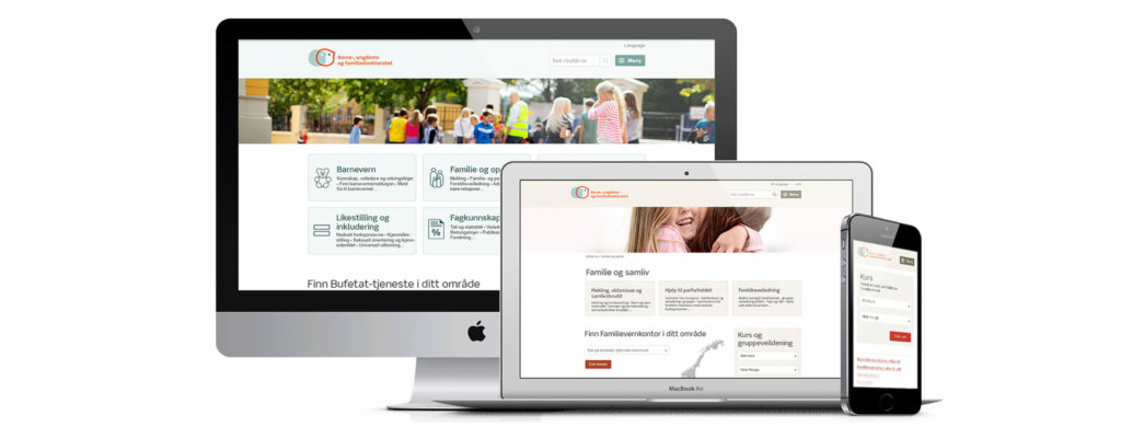
The Norwegian Directorate for Children, Youth and Family Affairs (Bufdir) handles matters that include child welfare, family relations, and discrimination. Previously, Bufdir had a large and comprehensive website that didn’t work: They got a lot of calls from people who were frustrated because they couldn’t find the information they were looking for, and spent a lot of resources answering these calls. In cooperation with Bufdir, we redesigned bufdir.no with focus on the users.
Number of pages on fosterhjem.no is more than halved. 60% increase in visitors and the information meetings fills up faster
Hanne Hafver Rønjum, Digital Communications Manager at Bufdir
Result
The new bufdir.no was released in spring 2015 and was warmly welcomed by the users, as well as Bufdir’s employees. Bufdir.no is a responsive website with a strong focus on universal design, structure, and a language that the users understand. Quickly after release, Bufdir saw the results of the new website:
- Significant reduction of phone calls to customer service and increased use of self-service.
- Users find what they are looking for, and are able to make informed decisions.
- More efficient customer service by phone, both for users and Bufdir
- Users and employees praise how easy it is to navigate with accessibility tools, such as screen readers.
- 60% increase in visitors to the foster home website.
- 157% increase in number of requests to become a foster home.
Users first
When redesigning a website of this size, our focus was on structuring the content to make it easy to find for all users, regardless of disabilities. To achieve this we had to avoid the trap of structuring the website in the same way as the organization, and instead structure the contents in the way users think. This choice was supported by results from user testing and interviews.
Two of the main reasons why people visit bufdir.no are because they’re worried about a child or want help in family issues. We used these findings, together with the rest of the user tasks, as a set of tools for prioritizing during the project.
Talking to people
We designed the graphical expression based on Bufdir’s existing profile, and it was important that the design framework supported all of Bufdir’s portals in order to create a uniform impression.
With children and family as a theme, we wanted to create a friendly and welcoming atmosphere. We actively used the design to achieve this, for instance, by using pictures of people and friendly faces.
After release we saw an increase of 157% in requests to become a foster home
Hanne Hafver Rønjum, Digital Communications Manager at Bufdir
Technology we used
- EPiServer 7.1
- Bootstrap + JQuery
- HTML5 + CSS3
- SQL Server 2012
- ASP .NET MVC 4
What we did
- Concept development
- Information architecture
- Interaction design
- Graphic design
- Universal design
- User testing
- Frontend development
- Backend development

Want to know more?
Send us an email and we will contact you.


