What is a design system, why you need it, and how to create it with Angular (or any other framework).

What is a design system
A design system is a bit of a fluid term that means something slightly different to each person, and organisation. This is a practical guide so we will focus on the common elements of a design system. It is the single source of truth for (among other) font, color, spacing, placement, brand, UX and components. It should contain everything a team needs to create a consistent application that looks and behaves like any other at a company/organisation. It should make it easy to create new websites without having to reinvent the wheel. It should be unambiguous and precise to prevent misunderstandings. It should be easy to understand.
A design system contains something called a component library. This is a series of ready to use components that can be used in your application. A good example here is how material design is a design system with Angular material, Vuetify and Material UI as it’s component library.
Other examples of good design systems include Lightning Design System (by Salesforce) and Carbon Design System (by IBM).
Why do you need a design system
Design systems are the solution to the problem of how to enable rapid development and innovation, while maintaining a consistent user experience, and design.
A new company usually starts out by creating one application/website. All elements are created specifically for that one application, and that’s fine. Having a design system for just one website is usually a waste of time. However, at some point another team starts making a new website, and then a third team starts making a third website. Soon you have several teams working in parallel on different solutions with different requirements. Deadlines are short and sharing knowledge between the teams is not prioritised. The websites will start out looking similar, but slowly drift away for each other and at some point you will end up with several versions of the same element, like for example a button. Then you are tasked with creating a new website, but what do you base it on. There are several versions of everything, and no single source of truth. This is the reality of so many developers, and is based on my personal experience. This is probably the time you decide to start looking into design systems.
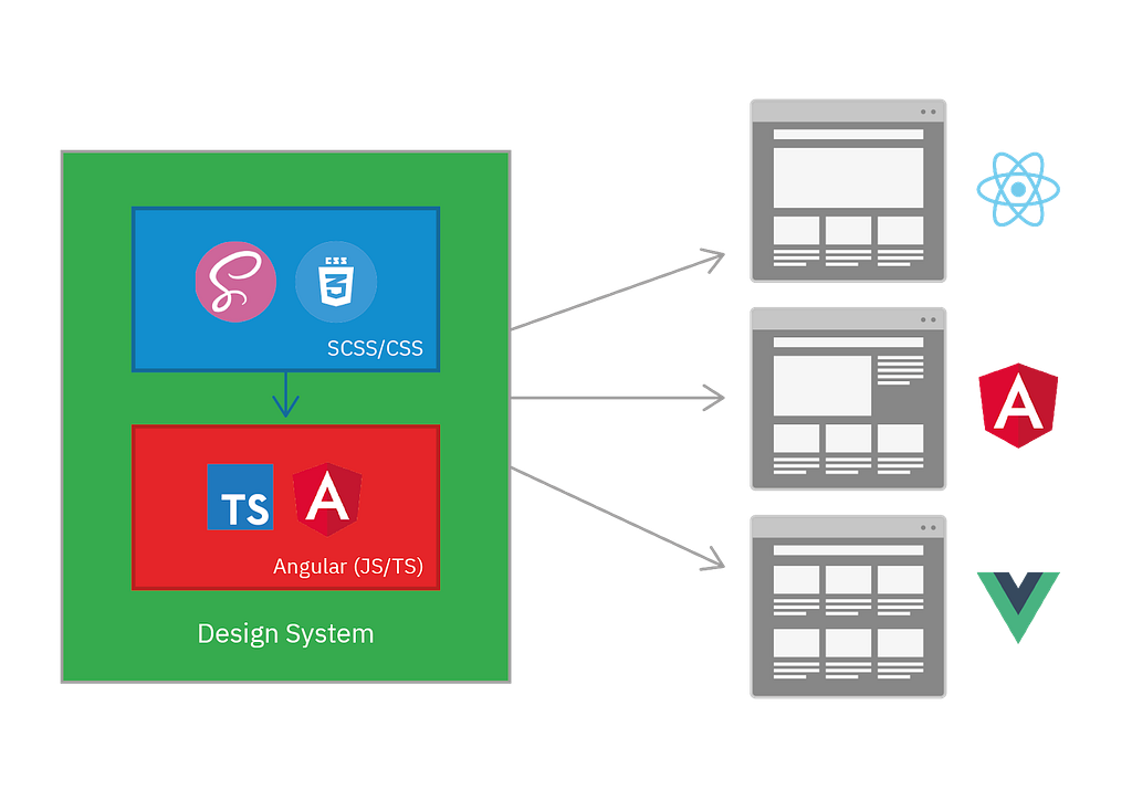
How to create a design system, and component library
There are several ways to create a design system, and a component library. My suggestion is a two part system with a CSS core, and a component library on top. Each as a separate project, and npm package.
A single source of truth
Remember that there should be a single source of truth. This means that the same documentation should not be duplicated. It’s tempting to put all of the UI and UX documentation in Figma or similar, but it should be in the CSS core. My suggestion is to put as much of the documentation in the CSS core, and only the documentation for the components in the component library. Figma (or similar) might be the basis for discussion and prototyping, but the resulting design system should not be contained there.
This gives us two parts The CSS core, and the component library that together becomes the design system, that’s used by all other systems:
Documentation
The documentation consists of everything from how to use the button, to how the button is placed in relation to the website and how to maintain your brand identity with it. Everyone creating applications at your organisation needs to be able to understand how to use a button, and the rest of your design system correctly. This includes practical examples, and interactive demos.
CSS
The next two parts are in code. You can do a lot with just CSS, and some simpler design systems are entirely in CSS. Remember that the limitations of CSS is good as it will stop you from creating ugly workarounds in javascript. Another reason is that CSS is cheap, JS is expensive. The same amount of CSS is way easier on the browser than JS. This means you should create as much as possible in CSS.
My suggestion is to have the CSS and JS parts and separate projects, and published separately. This will help preserve the separation of concerns, and increase modularity. This will in effect give you the CSS core, and a component library. It will also allow smaller websites to just use the CSS core without having to pay for the extra bundle size of the component library. Some websites will need that extra performance.
A Component library
The component library should be usable in ANY framework. This means we have to compile to web components. This is supported in Angular, and Vue (and a few smaller frameworks), but not fully in React. My suggestion is Angular as it has the most features that will help you when creating a component library. One of them is schematics which will allow you to write a script that automatically installs the design system in new Angular projects. Another is the Angular CDK, which is a series of low level building blocks for creating a component library, made by the Angular team.
This setup is similar to how material design have structured their design system with material.io being the CSS core with all the guides, and standalone component libraries, like for example Angular material.
I have attached a video at the end of this blogpost to get you started on setting up a new Angular project.
Conclusion
Creating a good design system is hard, but it is one of the best long term investments you can do. It is one of the most efficient solutions to the problem of development becoming slower and slower as the organisation grows, and more teams start to work in parallel. It is also the best solution to design drifting and inconsistent user experiences.
Extra resources
A in-depth look at web components
A tutorial on setting up a new Angular project
This blog post is a more in depth version of the talk i gave at ngVikings 2020
A practical guide to creating Design Systems was originally published in Grensesnittet on Medium, where people are continuing the conversation by highlighting and responding to this story.


