Length Units in CSS
And Their Importance for Accessibility
Introduction
There are several options for which length units you can use to determine the size of different CSS properties. Knowing how the various length units work and how to take advantage of them can be a key to generating clean style sheets, great user experiences, and inclusive websites.
A CSS declaration includes a property / value pair. The property value can include an integer or a keyword, a combination of keywords and integers, values with or without a CSS unit.
A length unit determines the size of a property. Most CSS properties accept a set of datatypes containing values and units. A paragraph, for instance, has the property max-width. We can assign the property max-width a value, and the value becomes part of the length unit.
p {
  max-width: 200px;
}
We have different categories of CSS length units: absolute, relative, and viewport.
Absolute length units
The so-called absolute length units have a fixed size. They don’t inherit from a parent element or change along with the viewport’s dimensions. Therefore they’re not recommended for use on screens, because they vary much in size, height, and width. Absolute CSS units will look the same, whether on desktop, tablet, or mobile, and are generally considered as always to be the same size.
px
The px unit is absolute. 1px is equal to a single point (“dot”) on a screen and is relative to the viewing device.
This length unit is not related to the current font neither to centimeters or inches. px is also a bit odd to use since it’s relative to a physical property and it messes up websites where zooming may be a need for users.
Example: A element with a width property containing a value and px as unit.
.element {
  width: 200px;
}
in, cm, mm
The absolute length units in (inches) cm (centimeters), and mm (millimeters) are not very typical in use on the web. Neither are they recommended or accurate enough for websites either.
These units are suitable for physical media, like papers, posters, and other printed work.
1in = 2.54cm = 96px
1cm = (96 / 2.54) = 38px
1mm = 0.1cm = 3.78px
Relative length units
Relative length units are beneficial for making responsive and accessible websites. They scale relative to a parent or the viewport, and style sheets written with relative units can more easily scale from one environment to another, like fram a desktop to a mobile screen.
Relative units are primarly of interest for the typography in your web designs. A good strategy for web design would be to set font sizes to a relative rather than absolute. Then it is easier to double or half the size of something instead of setting explicit values, like an image of 400px.
em
The em unit is relative to the current font size of the element.
em and rem units are practical for creating entirely scalable and flexible layouts. If a user resizes their text or changes the font size in the stylesheets to something larger or smaller, the em unit will scale proportionally.
Example: We want the font size of a child element to the half of the parent element — it can be a subtitle in the main heading. If the font size of the main heading is 44px, the child will become 22px.
.child {
  font-size: 0.5em;
}
rem (“root em”)
The rem unit is relative to the font size of the root element (e.g <html> or :root {}). As with em, the rem unit will scale but with the root element instead of a parent.
Example: Titles are often larger than body text. The :root font-size is 16px. We would like that all H1-elements should be twice the size. Instead of defining 32px to a H1-element (which is first of all fixed and will not make it relative to other than itself), we can use rem instead:
h1 {
  font-size: 2rem;
}
A rem unit is so useful that it also scales with the user’s preferences in the browser. Most browsers do have a default font-size, often set to 16px. If there were no default font-size property set on the :root element, the browser’s build-in font-size would be used instead and still scale the website correctly.

Above is an example of the browser settings for font-size in Firefox.
ch
The ch (“character”) unit is relative to the width of the zero (0) character in the font for an element.
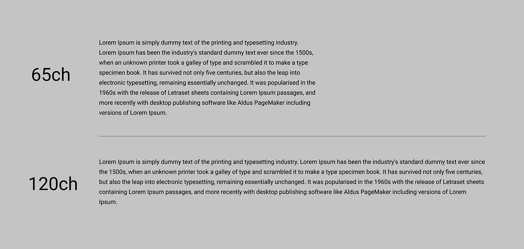
On a webpage, paragraphs and blocks of text should not be too long, either too short. This is essential for people who have cognitive disfunction or reading difficulties. With the ch unit, we can determine how many characters, e.g., a paragraph, should have on each line. It seems to be a standard agreement on the internet that a paragraph text should not be more than 65–75 words per line (including spaces) to be most readable.
Example: A paragraph with 65 characters per line for best readability. Look at the difference in user experience in the two images below.
p {
  max-width: 65ch;
}
ex
The ex unit is relative to the x-height of the font. It is rarely used, but is much the same as the ch unit, just for height instead.
Viewport length units
Viewport length units are useful sometimes as they’re always relative to the viewport’s size. Viewport units can be helpful in cases where percentage (%) is hard to make it work. The viewport is defined by the size of a browser window.
viewport == browser window size
Viewport Height (vh)
The vh unit is relative to 1% of the viewport height.
1vh   = 1% of viewport height
100vh = 100% of viewport height
Example: We have a landing page where we want an image placed at the very top. The image should take up the entire screen height — like a full-screen section feeling — and when we scroll, the rest of the content will show up. The content below could take up half the viewport height:
// See this example on Codepen.
.image {
  background: #F5BE70;
  height: 100vh;
}
.text {
  height: 50vh;
}
Viewport Width (vw)
The vw unit is the similar to vh, but vw is relative to 1% of the viewport width.
1vw   = 1% of viewport width
100vw = 100% of viewport width
Example: We want a left-positioned childdiv that takes up 50%width of a parent div, based on the width of the viewport.
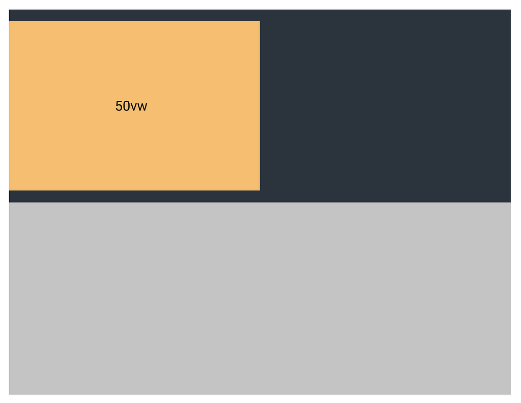
// See this example on Codepen.
.parent {
  width: 100%;
  height: 400px;
  background: #2B343C;
}
.child {
  width: 50vw;
  height: 300px;
  background: #F5BE70;
}
Viewport vs. Percentage
Viewport sizes are similar to percentage units, but work differently.
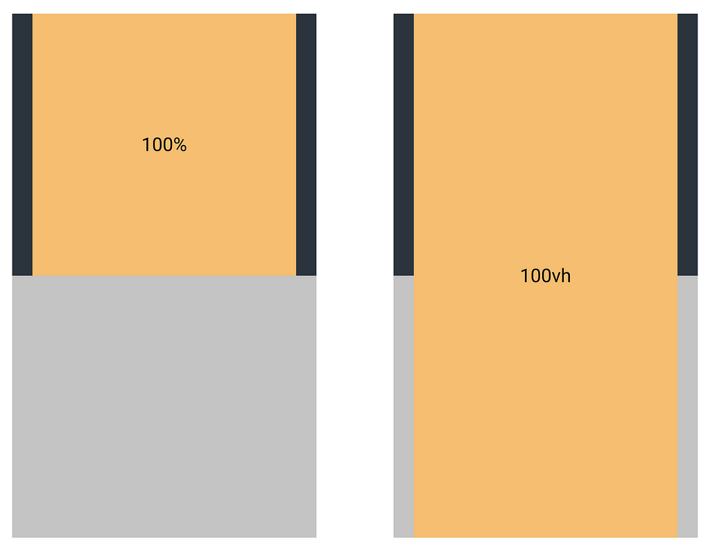
Percentage units always inherit the size of their parent element, not the viewport. Viewport units are always calculated by the size of the viewport size, which means it can extend the size of it’s parent.
Example: You have a parent div element with 400px of height and a child div element with a height of 100%, then the child div will in theory potentially be much higher or smaller than the size of the viewport.
Using 100vh instead, on the child element, we can ensure that it fills up 100% of the viewport’s height and not necessarily the parent div element. This can be very useful when having banners that take the full height of the screen featured on the top on the website.
(Illustrated in the image below)
// left side of example - see this example on Codepen.
.parent {
  height: 400px;
  background: #2B343C;
}
.child {
  height: 100%;
  background: #F5BE70;
}
// right side of example - see this example on Codepen.
.parent {
  height: 400px;
  background: #2B343C;
}
.child {
  height: 100vh;
  background: #F5BE70;
}
Viewport Maximum (vmax) and Viewport Minimum (vmin)
vmin (“viewport minimum”) is relative 1% of the minimum browser viewport‘s dimensions. 1vmin = 1vh or 1vw, based on whichever dimension of the viewport who is smallest.
1vmin   = 1% of viewport height or width, whichever is smaller
100vmin = 100% of viewport height or width, whichever is smaller
vmax (“viewport maximum”) is relative to 1% of the maximum browser viewport‘s dimensions, based on whichever dimension of the viewport who is largest.
1vmax   = 1% of viewport height or width, whichever is largest
100vmax = 100% of viewport height or width, whichever is largest
When are they useful:
vmin and vmax are particularly useful for typography. Typically we will use @media queries for setting different text sizes as the applications layout scale based on a variety of devices’ height and width — like mobile phones and desktop computers. It seems that finding the right values needs some tweaking and see how you want it.
// See example on Codepen.
h1 {
  width 10vmin;
}
Using relative CSS units is excellent for making websites that should be used for multiple device resolutions and focusing on accessibility and the best user experience.
Thanks for reading!
Code foh shizzle
Length Units in CSS was originally published in Grensesnittet on Medium, where people are continuing the conversation by highlighting and responding to this story.